

One of the areas where colour psychology in marketing has gained significant interest is marketing. The impact of colour in marketing is a well-established concept that has been extensively studied. Colours play a critical role in brand recognition, consumer behaviour, and purchase decisions.
The use of colour in branding is an essential aspect of marketing. Brands use colours to differentiate themselves from their competitors and to create a unique identity. For example, the colour red is commonly associated with Coca-Cola, while the colour blue is associated with IBM. Colour psychology in marketing is crucial in influencing consumer behaviour, and the right colour choice can increase brand recognition and encourage purchase decisions.
Jump to a section:
Colour is an essential marketing tool
Colour Influences 85% of Shoppers’ Purchase Decisions.
Colour is an essential marketing tool
The use of colour in branding is an essential aspect of marketing. Brands use colours to differentiate themselves from their competitors and to create a unique identity. For example, the colour red is commonly associated with Coca-Cola, while the colour blue is associated with IBM.

The use of colours in branding can also evoke emotions and feelings that can influence consumer behaviour. For example, the colour green is often associated with sustainability and the environment, which can appeal to consumers who are environmentally conscious.
The impact of colour in marketing can also vary depending on the product being sold. For example, food companies often use the colour red to stimulate appetite and encourage food purchases. Health and wellness companies, on the other hand, may use the colour green to evoke a sense of health and well-being and organic products.
Colours also play a critical role in advertising. Consumers are more likely to remember advertisements that use colours consistent with the brand’s identity. Research has shown that colour can increase brand recognition by up to 80%. Ads that use bright and bold colours capture attention and are more memorable than those using muted tones.
Also read: Power of Smile
History of Colour
The history of colour refers to the evolution of human knowledge, understanding, and use of color throughout history. It encompasses various fields such as art, science, technology, and culture.
The earliest known evidence of colour usage dates back to prehistoric times when cave paintings depicted animals and people using natural pigments made from rocks and earth. Ancient civilizations such as the Egyptians, Greeks, and Romans used colour symbolism in their art, literature, and religious practices. For instance, blue represented the heavens, red represented power and authority, and yellow represented the sun.
During the Middle Ages, colour symbolism became more intricate and complex. Artists developed new techniques to create vivid colours, and colour symbolism became an integral part of religious and secular art. The Renaissance period saw a renewed interest in colour, with artists such as Leonardo da Vinci and Michelangelo experimenting with light and shadow to create more realistic and lifelike paintings.
In the 19th century, advancements in science and technology led to the discovery of new synthetic pigments and dyes, which revolutionized the way colour was used in art and design. The Impressionist and Post-Impressionist movements of the late 19th and early 20th centuries emphasized the importance of colour in art, with artists such as Claude Monet and Vincent van Gogh using vibrant colours to convey emotions and mood.
Today, colour continues to play a significant role in various fields, from branding and advertising to interior design and fashion. The study of colour, known as colour theory, continues to evolve as researchers explore the psychological and physiological effects of colour on human perception and behaviour.
Colour Wheel
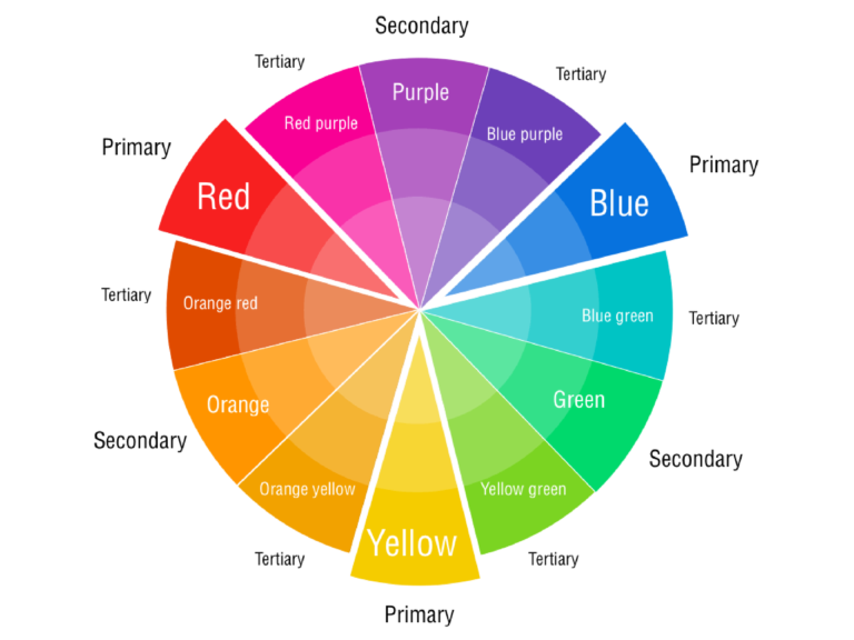
A colour wheel is a circle that shows all the colours we can see, arranged in a special way. There are three main colours called primary colours: red, blue, and yellow. When we mix two primary colours, we get secondary colours: green (mixing yellow and blue), orange (mixing red and yellow), and purple (mixing red and blue). When we mix a primary colour with a secondary colour, we get tertiary colours: yellow-green, yellow-orange, red-orange, red-purple, blue-purple, and blue-green. The colour wheel helps us understand how colours relate to each other and how we can use them together to make things look good.
A colour wheel is a useful tool for artists, designers, and anyone who works with colours, as it can help them create harmonious colour schemes and understand how different colours relate to one another.
Colour influences 85% of shoppers’ purchase decisions.
Colour can also influence purchase decisions. Colours can influence the quick decisions that consumers make when shopping. For instance, marketers often use the colour red to create a sense of urgency and encourage impulse purchases. Consumers can find the colour blue appealing because it is associated with trust and security, which can influence their purchase decisions.
The colour Pink is commonly used for different baby products, toys, makeup or desserts and female hygiene products as well.
Colour Category
Colours can be categorized into three main groups: warm, cool, and neutral.
Warm
Warm colours are those that are associated with warmth, energy, and excitement. Examples of warm colours include red, orange, and yellow. Additionally, the colour yellow is a positive colour which signifies warmth and happiness. Moreover, yellow is an attention grabber, and products like taxis, school buses, Maggi, and McDonald’s use yellow for this reason. Furthermore, these colours tend to evoke strong emotions and can be used to create a sense of urgency or enthusiasm.
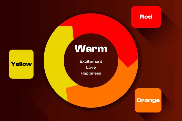
Orange is preferred as a fun, adventurous, cool and optimistic colour. Yellow and orange can be used as caution and warning signs. Products like Fanta, Harley Davidsons Motorcycle, and JBL use orange in their brand logo.
Cool
Cool colours, on the other hand, are associated with calmness, tranquillity, and relaxation. Examples of cool colours include blue, green, and purple. This colour signifies loyalty, elegance, and sophistication. All higher-end products that want to portray a sense of luxury by using purple. These colours can be used to create a sense of calmness and serenity.
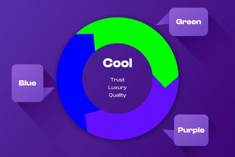
Facebook’s logo features the cool colour blue, which is often associated with trust and reliability. Similarly, Samsung’s blue branding also creates a sense of stability and reliability.
Neutral
Neutral colours are colours that do not belong to either the warm or cool category. A designer can typically use neutral colours to create a sense of balance and harmony in a design or composition. Neutral colours such as white, black, grey, and beige can also complement other colours and create contrast.
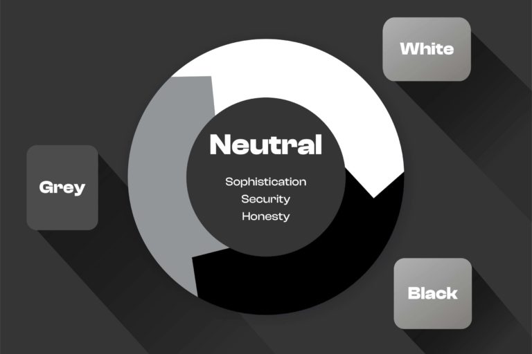
The colour black signifies authority, power, and strength and at the same time conveys luxury, sophistication, and mystery. Black can be used in contrasting other colours. Adidas, Prada, and Jaguar are the brands associated with black.
White is a colour of purity and peace. It is popular in health care brands. White signifies a blank canvas so any brand with unique products tends to use white in its branding.
Psychology of Colour
Research indicates that colour can have an impact on cognitive performance, including memory. While red ink may not be the best choice for grading exams, studies have found that merely seeing the colour red before taking a test can negatively affect test scores. This is because colour can influence attention and arousal levels, both of which are important for memory performance. Memory is a complex cognitive process that involves perception, attention, and thinking, and colour can play a role in enhancing attention and memory. The use of colours with high contrast, such as white on red or black on white, can improve memory retention in both the short term and the long term. In summary, there is strong evidence supporting the relationship between colour and cognitive performance, particularly memory, and attention.
Colour meaning summary
Below is a brief overview of different colours and the significance or symbolism associated with them.
Red – danger, passion, excitement, energy
Pink – feminine, sentimental, romantic, exciting
Orange – fresh, youthful, creative, adventurous
Yellow – optimistic, cheerful, playful, happy
Green – natural, vitality, prestige, wealth
Blue – communicative, trustworthy, calming, depressed
Purple – royalty, majesty, spiritual, mysterious
Brown – organic, wholesome, simple, honest
White – purity, simplicity, innocence, minimalism
Black – sophisticated, formal, luxurious, sorrowful
Multicolor – United, open, diversity
In conclusion, the impact of colour in marketing cannot be overstated. Colours play a critical role in brand recognition, consumer behaviour, and purchase decisions. Understanding the different aspects of colour psychology is crucial in using colours effectively in marketing. By using colors strategically, brands can create a unique identity, capture attention, and influence consumer behaviour.